Blog
quarta-feira, 2 de julho de 2008
About Flash in websites
This week I read in CNET News that Google, Yahoo and Adobe are working around some limitations on searching and indexing content within SWF files, those made using Flash. They say it would – finally! – make it possible to search content from websites built using Adobe Flash.
I never liked Flash as a solution for creating websites. Although it has many cool features for navigation and animation, when it comes to data and information retrieving, it really sucks. The way I see it (and you may not agree with me, that’s OK!), the Web is mostly about retrieving data…so, IMHO Flash is not the right tool for building a website, unless you’re not concerned with “minor” details like:
- Making it searchable – that will be fixed soon, but till today, it’s almost impossible to index content from a SWF file. Some people try to get around this limitation using meta tags in the page that hosts the SWF file, but it’s merely impossible to make it search-friendly like a regular HTML webpage.
- Making it possible to copy the website content – althoug this already can be done, mostly it’s not how people built their SWF files. If you want to copy the content of a flash website, you will have some trouble because mostly they’re not built with this in mind. After all, what matters is to make a “cool flash site”, isn’t it?
- Creating different URLs for each section of a website: most flash websites use a single URL for the whole site, instead of creating different pages, which make it impossible to bookmark a specific page or use the “back” and “forward” browser features. If you want to keep a specifc section of a flash website in your bookmarks, well, you just don’t have a way to do it, unless the site has different pages for each section, using different HTML files for each SWF file.
- Using standard elements for navigation – each browser, each OS has it’s own elements for navigation, like scrollbars, buttons, forms. These elements work fine with the computer hardware (like the scrolling button in a mouse). But, why use these elements if you can create your own using Flash, right? So, flash websites mostly use tiny buttons, nasty scrollbars that doesn’t work with a regular mouse scrolling wheel (some people who make flash websites can make it work, but mostly they just don’t care about that), and forms that doesn’t work very well without a mouse (if you like to use ‘tab’ key on the keyboard to change from a form field to another, for example, instead of using your mouse).
- Flash websites can’t be read by blind people. Most blind users have programs that allows them to “read” a website content. But as flash is an element that can’t be interpreted by those programs, blind people can’t use a Flash website. Accessibility is a huge issue to be overcome by Adobe.
That’s why I still think that Flash is not a propper tool for building a website. I would use it very carefully, for creating elements of a page (and even so, I would make some alternative elements for accessibility issues, using CSS), but I would NEVER use it for building a whole website. Maybe one day the browsers and flash will work fine together, but till this point, they just don’t work. And as I’m more concerned about creating useful information systems than creating “emotional” and “cool” websites, I stick to the basics.
HTML works just fine.
PS: this is old, and Nielsen is a little fanatic, but still worth reading: Flash: 99% Bad
quarta-feira, 25 de junho de 2008
Taking pictures with digital and analog cameras
The first time that I went to Europe, I took my Pentax K1000 camera. At that time, in a month I must have taken about 250 pictures, using 35mm films.
This time, I took it with me again, but I also had my digital camera, a Sony DSC W5, and an old HalmaFlex using 120mm films, which belonged to my grandfather.
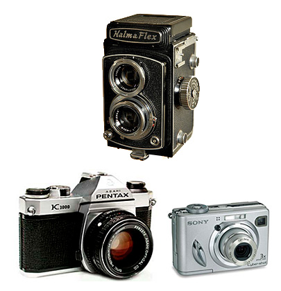
My three cameras.
After a month, I must have taken about 2000 pictures with the digital camera, 72 with my Pentax, and less than 24 with the HalmaFlex. I’ll have to choose among these 2000 digital photos those that will be printed – if any! But it’s certain that all pictures taken with the Pentax and the HalmaFlex will be printed.
Each camera has a unique “flavor”, and they provided me different experiences using each one of them…the time I spent making a single shot; the fact that with the digital camera I could “see” the pictures; the options the Pentax gives me for deciding the combination of time and aperture, and the surprises that awaits me till I have the photos printed.
It’s common to say that the digital cameras have changed the way we relate to photos, and the way we take pictures. But as I used the HalmaFlex, that doesn’t have a photometer and have a very odd screen for previewing the image that will be “captured”, I was able to taste a little bit of the changes promoted by cameras like my old Pentax K1000.
The most mundane habits of our everyday lifes can really be affected by technology.
quarta-feira, 25 de junho de 2008
Coming back
Just a short note, to let you know that this website is not abandoned – at least, not anymore. I have gone out for a while, visiting some friends in distant lands, but I’m back. Have many stuff to catch up, and many things I want to write about. I’m not sure I’ll be able to do this, because I have to work on my thesis. Let’s see what happens…
terça-feira, 6 de maio de 2008
When publicity beats functionality
Rio de Janeiro’s underground public transport system (the “metro”) is an interesting case of a bad signage system/information design. Not that they didn’t have a good signage system. In fact, till a few years ago, the original signage system was up and running, and doing a very good job in my opinion. Some updates were necessary, but the general design guidelines were just fine and could be used for a long time.
But, as it’s becoming a trend nowadays, a recent “new management” has decided to change the Metro’s image. A new brand strategy. And, as you may imagine, they worked hard to make us believe that they were doing better than the old management. But, as a designer, I usually see beyond the brand discourse.
One thing I’ve noticed is that the underground stations are cluttered with publicity ads. Most of them are from the Metro itself, trying to convince us that they’re great. But in reality, in many cases they make so much “noise” in the landscape that the signage become less effective.
Recently they started to change the signage. And it seems to me that they haven’t tested the signs, as some information are really hard to read. Small letters that some people won’t be able to read at all. You should be under the signs to read them! If you’re looking for a certain exit, it’s possible that you have to walk through the station only to discover that you’re on the wrong exit. It’s merely impossible to read the signs from a long distance.
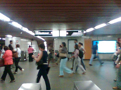
The new design for the Metro signage. Too much information on a sign, with small letters, making it impossible to read at a certain distance. Why not use more panels, with less information per sign, and with a correct font size?
It’s not difficult to see different sign systems side by side. The “old” system is still there, while the “new” one is also in use. The new design lack from basic standards. While the old system used Helvetica for all the signs, the new design use different type faces in different signs. I have noticed at least 3 different fonts used for the same kind of sign. Actually, this maybe a mix of different sign systems that are still in use.
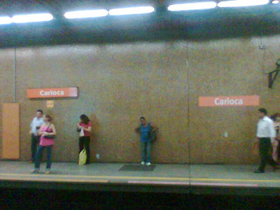
On the left, the second version of the signage system, using Frutiger. On the right, the new one. They have placed the signs very close to an average person’s height, and if you’re inside the train and there’s a crowd outside, you will have some trouble reading the signs.
When I walk around some public places, I usually try to think as someone who is not familiar with the city. In the Metro stations it’s clearly impossible to find useful information easily. Where am I? What’s nearby? What are the exits? Where are the exits? Instead, many publicity ads are in every wall, at every pathway. There are some maps, with bad design, that shows the underground lines and it’s connections with the bus lines. But there are only a few of them, especially when compared to the ubiquitous publicity ads. They’re a few, and usually at a wrong scale, in my opinion.
Inside the trains, the situation isn’t any better. As the Metro expands, the map showing the lines and stations gets worse. Too much information with a bad information design, making it difficult to understand which connections are available at each station. And even if you can understand the map, you will have some trouble just to find it! The maps are placed above the exits of the train, the exact place where people can’t stop for a long time! There could be more maps, bigger maps. But instead, they have put more publicity ads inside the train.
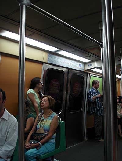
I was seated in the middle of the train. The map with the stations is placed very far and it’s impossible to read it from where I was
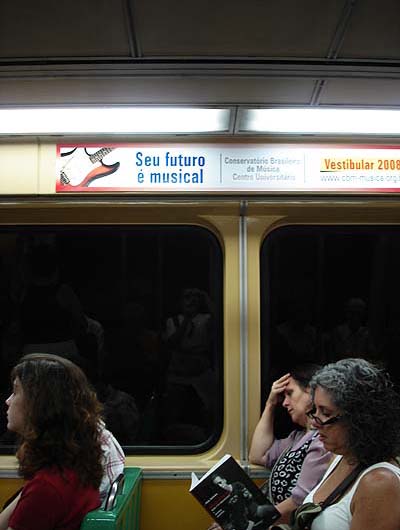
I was seated in the middle of the train. Instead of a map with the stations, a publicity ad was placed near me, and this I could read perfectly.
That’s what happens when it’s more important to make people believe that you have a good service, instead of providing a real good service! That’s what happens when publicity beats functionality.
segunda-feira, 28 de abril de 2008
Feira ‘in english’
As you may have noticed, I’m starting to write in english here. I intend to broaden the audience of my website, and to improve my english skills as well.
segunda-feira, 28 de abril de 2008
Being Human: Human-Computer Interaction in the Year 2020
My printed copy of the Being Human: Human-Computer Interaction in the Year 2020 report arrived this week! Although I have already downloaded a PDF file with the same content, the printed version is much more pleasant to read.
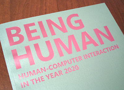
This report is a result of a forum entitled HCI 2020: Human Values in a Digital Age that took place in Spain, on march 15-16, 2007, gathering researchers and practitioners of computing, design, social sciences, and scientific philosophy to discuss, debate and help formulate an agenda for human-computer interaction (HCI) over the next decade and beyond.
It’s curious that they have decided to name their report as a parody of the classic book from Negroponte, Being Digital. I guess they’re right…the time of the computers, as we know them, is about to end. We should be more concerned about the human part of the ‘human-computer interaction’ in the years to come.
Although I can’t say that I’m reading many new stuff, as mostly they’re discussing the same topics that I’m studing in my PHD research, it’s very refreshing to see that I’m not crazy in pursuing this discussion! The greatest difference is that while I’m basicaly doing a theoretical research, people are actually developing concepts and products for this upcoming world (I guess that’s an issue that I have to deal with, for living in a country that has not a role in developing computing technology). And, of course, with so many good people gathered together, the ideas and questions they came up with are very interesting.
A quote from the report, that may give you a brief understanding of it’s principles:
Computer technologies are not neutral – they are laden with human, cultural and social values. We need to define a new agenda for human-computer interaction in the 21st century – one that anticipates and shapes the impact of technology rather than simply reacts to it.
If you’re interested on this subject, take a look at the Being Human website. You can download a PDF version of the report there, or ask for a printed copy.
terça-feira, 8 de abril de 2008
2º Encontro Brasileiro de Arquitetura de Informação
Está no ar o site do 2º EBAI – Encontro Brasileiro de Arquitetura de
Informação. O evento este ano será nos dias 17 e 18 de outubro, em São Paulo.

A chamada de trabalhos já está aberta. Participe!