Blog
quarta-feira, 26 de maio de 2010
Oficina Miríade
Acaba de sair do forno mais um projeto: o site da Oficina Miríade Trata-se de um grupo de profissionais que prestam serviços bibliográficos, de diagramação e encadernação.
![]()
Nesse projeto, optei por um visual bem limpo, trabalhando basicamente a tipografia. A intenção era que as fotos dos trabalhos se destacassem na página, deixando os elementos de navegação bem discretos. Assim a página final é leve, tanto visualmente quanto em bytes, facilitando o carregamento nos navegadores.
As familias tipográficas utilizadas foram Mrs. Eaves para títulos, e Georgia para os textos.
Partindo de um grid de seis colunas, todos os modelos de página seguiram um padrão bem semelhante. A arquitetura do site é simples, dividida de acordo com os serviços prestados (serviços bibliográficos, serviços de diagramação e serviços de encadernação). Além desses 3 eixos principais, há ainda o Blog, a página com o formulário para envio de email, e a página que descreve a equipe da Oficina Miríade. O site foi feito com WordPress.
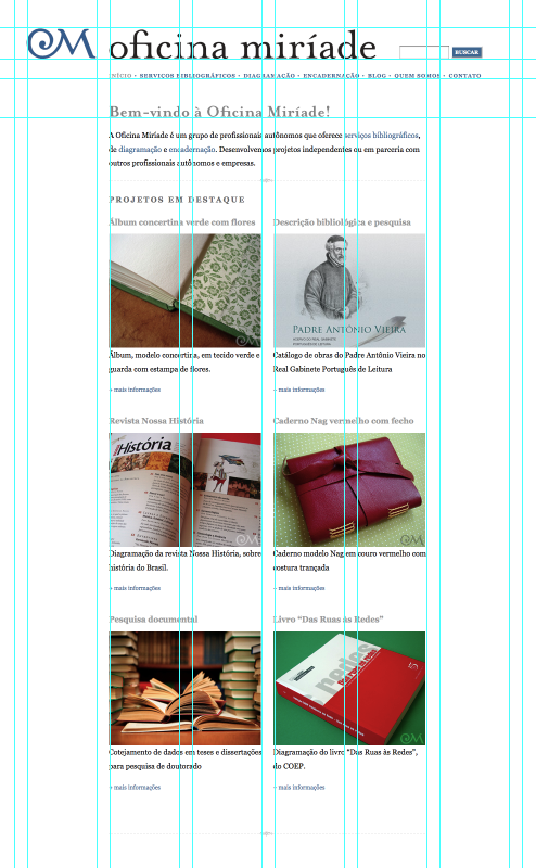
A tela de entrada do site.
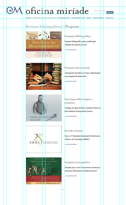
A tela da seção Serviços Bibliográficos.
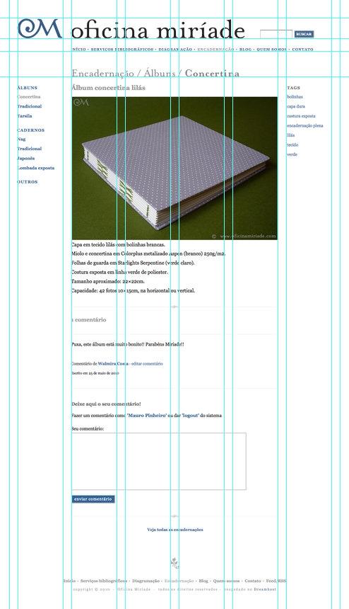
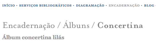
A tela com a descrição de um dos álbuns, na seção Encadernação.
domingo, 4 de abril de 2010
Yogurt’s logo. Different brands, similiar taste.
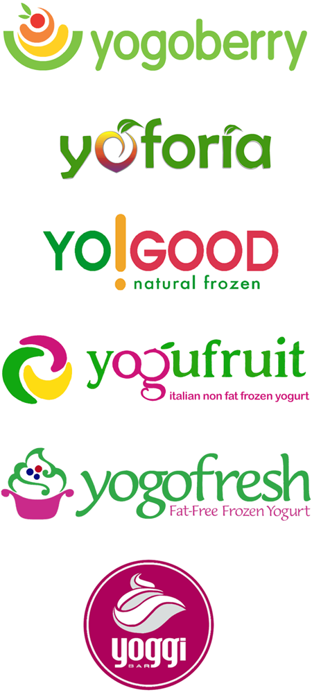
The ‘frozen yogurt’ logo’s. All different. All the same.
Here in Rio de Janeiro, the “italian frozen yogurt” has spread out as the most recent summer goody. The summer has been really long and hot this year, and as frozen yogurt is really tasty and is also low fat, it is easy to understand why it has become a huge sales success. You can have a delicious and refreshing goody without worrying too much with gaining weigth. It is perfectly suited for Rio de Janeiro’s spirit.
I’m not sure which frozen yogurt brand was the first one to arrive here. But, as soon it started to become famous, many other brands has appeared. Today we have different brands, selling basically the same stuff, and using pretty much the same strategy, the same service.
What is most interesting about this is that they also share the same tone of voice. Their communication and design identity are very much alike.
Before I actually tasted a frozen yogurt, I didn’t realize that there were different brands. They all looked the same to me, because I wasn’t really paying attention to the stores. I wasn’t interested in the product they were selling, so I didn’t care about the sales point.
But once I tasted the yogurt, and since then I became a regular customer. And as I started to pay attention, I realized that there were stores in every corner of my surroundings. Really, in my neighborhood there are many frozen yogurt stores, from different brands. I then realized that they were different, but I also realized how similar they were.
One day I went “photo hunting”. I took my camera with me, and took pictures of each store. They are all much alike, the people who work there all appeared to have the same training, although they work for different companies. What strikes me the most is that the logos are also very much alike. If you look at them a little bit more carefully, you can see they are totally different from each other. But I’m pretty sure the regular customer won’t notice the differences.
This made me wonder: to which extend a similar product can lead to a similar design/communication solution? Although the frozen yogurts sold on these stores are basically the same stuff, couldn’t they have used a more unique design solution to communicate with their customers?
terça-feira, 9 de março de 2010
Abigail Sellen: Being human in the digital Age
Browsing around, I just found this presentation from Abigail Sellen, principal researcher at Microsoft Research Cambridge. She is also co-manager of the Socio-digital Systems Group. I get to know her work after reading the MS Being Human Report, and I had the fortune to meet her at MS Research, in 2008, while I was traveling in the UK.
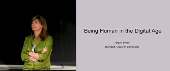
In this presentation, Abigail Sellen talks about the challenges we face – as society and as members of the HCI community – in the years to come, and proposes a new agenda for the digital technology development. The presentation is 54 minutes long, so you better get some popcorn, and a notebook to fully enjoy it!
segunda-feira, 8 de março de 2010
Lectures and presentations now @ feira moderna
I finally managed to put my lectures into this website. I have been uploading them to Slideshare, but untill now I didn’t have a propper place in my own website for them. I usually posted them here, at the blog section, and pointed to the other presentations at Slideshare, but it always bothered me that I didn’t have a unique place here to put all of them together.
Now I’m happy to announce the new ‘lectures’ section of this website. There you will find all my lectures and presentations. This content is now integrated to the rest of the site, so it can be found using the search, is listed in the archives and so on. Comments are also allowed (although it was already possible to comment in Slideshare). I’m still using Slideshare as the engine, by the way. But now there is no need to go there to navigate through the other presentations.
So, if you can spend some of your time, take a look at the new lectures section.
terça-feira, 23 de fevereiro de 2010
Interview with JooYoung Oh about Design research
My colleague (and former teacher) Gabriel Patrocínio just sent me a precious link, to an interview with JooYoung Oh about Design research. JooYoung is a design researcher who has conducted design research for companies such as Dell, Whirlpool and Samsung.
In this interview, JooYoung talks about the changes occured in the design field and in the market in the past years. Once product design was functional oriented, and now companies try to get a better understanding on what makes people choose among different products. As today products from different companies are much more alike, having pretty much the same basic functions, how do we make something different, that appeals to what people desire? Design research tries to answer this question.
I’ll quote some excerpts from the interview:
It’s natural for companies to shift from a functional to an aspirational focus. Differentiating with features and functions doesn’t help you stand out in the market anymore. You cannot invent another mouse trap and expect to succeed. You have to differentiate yourself by creating emotional connections with your target audience. For example, MP3 players all play music and you can endlessly add functions yet the most successful MP3 players are not the ones that have the most features; they all work equally well. Products that are able to steal our hearts are going to stay and people will come back to you over and over.
Reading this interview, I got thinking about my personal experience with design research. While I worked at Globo.com, my team have conducted usability tests, phocus group, and used other research methods in order to bring some of the final users’ desires to the design process. And now, as a teacher, my students have to work close to the people who will use the products they design. The final users help to design the stuff. One of my goals is to make the students aware that they can’t decide what is best for the end user alone, they have to learn with the final users. To do so, the people who will use the product should participate in the design process. In many aspects, I feel like I’ve been doing design research for a long time, although without an explicit intention or a conscious and rigid methodology.
It is important to note, though, that bring users close to the design process doesn’t mean that people will really design stuff. The statement “designers are not users // users are not designers” is a valuable one, and it is important to have this in mind.
Would you call your practice method a co-designing approach to design research? What are the major differences between user-centered and co-designing approaches to design research?
People mix the two terms all the time. When I use the term co-creation, designers often misinterpret it and think, “Oh, you think regular people can do our job”.
In the co-creation process, designers are still the [design] experts, yet we acknowledge that people are experts of their own experience. One cannot exist without the other. We do encourage non-designers to be creative and express their ideal experience and solutions during the interview process but we never use this information as it is. We turn the information into design cues and principals to feed the design process later.
One of the things I have always wanted to do, but was never really able to do, is to watch people using the products in a real situation, without the controlled environment of a laboratory or the formal interview scenario. Usually when in such a situation, people tend to say things that are not necessarily true – they say what they think we want them to say! But design researchers must watch the real situation, people at home using the products, on their everyday routine. There is much to gain with interviews and usability tests, but much information is better perceived when people are at ease, without focusing on a task.
You can’t just do co-creation exercises without observation or contextual research. For example, when we were conducting mobile phone research in Latin America, the co-creation exercise was always combined with contextual understanding coming from being there in the participants’ own environment.
A lot of valuable information comes from inserting yourself into the participant’s life. One should always follow Do-Say-Make. Observe what people DO, listen to what they SAY and give them tools to MAKE things that represent their ideal experiences and solutions. Depending on your subject matter, you may plan your approaches. For example, if you are trying to help a company create a new surgical tool, you may want to start with days of observation followed by a co-creation exercise in order to gain knowledge around the particular situation that you are unfamiliar with
One of the challenges of design research today, in my opinion, is to represent the data collected during the research, and to make this data useful and understandable for those who are outside the research team – usually, the clients. This is particularly difficult when we are dealing with subjective data, like emotional and experience design. I was intrigued by JooYoung interview, when she said that she is designing some research tools to achieve the representation of this kind of data.
Whatever methodology you use, you want to be able to deliver the insights to the people coming up with the product in a ‘feelable’ form. Sometimes all this amazing data gets lost because it’s in a wordy report format. Insights should be delivered in an experiential form through which people can experience how their target audience feel and think.
The representation of insights and information is extremely important. It should be easy to digest and multisensory. To be able to achieve this, I start designing the research tools [to be] multisensory and experiential. When we provide participants tools that are already experiential and multisensory you have less work to do to represent insights in such a format.
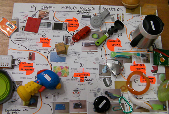
Some of the tools used during the design research. Photo by Design Droplets
Design research is something that we, as designers, should be able to do more often. It is sad that many of us (or our clients) don’t have the time, the budget or the experience to do it.
Read the full interview with JooYoung Oh at Design Droplets’s website.
segunda-feira, 15 de fevereiro de 2010
Left or right?
I’ve already written about how bad is the signage system in Rio’s subway, the Metro. Not only it’s cluttered with advertising – seems like they want to place an advertising in each sign, no matter if it will make the sign less clear – but also it’s a mixture of many different previous signage systems, each one of them using different typographic concepts and solutions. Obviously, this mixture make the whole system even more confusing, like many different voices were trying to talk to us at the same time, with different accents and voice tones.
I don’t take the subway very often, but every time I do it, I find something that gives me chills on the spine. One of these days I saw a map that was placed above the stairs, in such a way that it was impossible to read anything. The map was in the wrong scale, making it hard to read anything from a certain distance, and placed in the worst location one could imagine. The only way you could read something was being in the middle of the staircase, looking up, like if you were asking heaven for some guidance. I should take a picture of that sometime…
The last time I took to the Metro I saw this sign (see photo bellow), pointing to the exits.
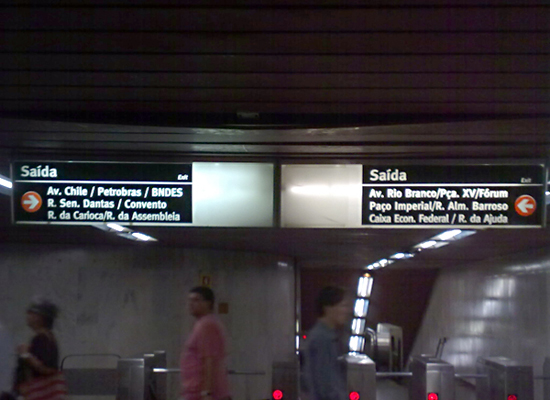
Rio’s Metro sign system, at Carioca station. The sign at the left points to the right, and the sign on the right points to the left. And, believe it or not, the upper text in the right corner of each sign is “Exit”. Can you read anything at this scale?
The “beauty” of this is that the sign on the left side is pointing to the exits that are on the right, and the sign on the right side is pointing to the exits that are on the left. I was totally confused when I was leaving the Metro. My natural reaction to any sign like this is to think that the information displayed on the left would be related the exits and pathways on the same direction. I was expecting to read the information about “Av. Chile” exit on the right side, and was almost leaving when noticed that the sign on right side was pointing to the exits that I knew were on the other way. That made me completely confused, so I had to stop and read everything carefully. I barely noticed that the arrow was pointing to the other direction. I finally realized that the exits hadn’t changed places, and that the signage was crazy, not me.
I’m not even complaining about the bad typographic solution (wrong scale, bad use of the space, advertising spots side by side with the signage). This is already as bad as it can be…I have to come close to the signs to read them, what is a bad thing for a signage system that should help you make decisions quickly, considering that you may be in a hurry and don’t want to waste your time.
Am I too picky, or this signage is as bad as I think it is? Drives me crazy to know that the Metro has many (so called) designers working on its signage system.